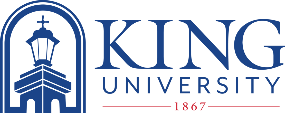
King University has revealed a new logo, introducing an image this week that honors the University’s iconic Georgian architecture and lasting Christian academic heritage.
King’s students, alumni, and friends will all recognize in the logo the illuminated tower that stands on the Oval, as well as the shape of the brick arches that are a signature of the Bristol campus.
“We wanted a design that affirms our heritage, reminds our community of the heart of campus, and reinforces a sense of home,” said Alexander Whitaker, president of King. “The old logo served us well for many years, but it was time for a refresh.”
The idea for the logo was developed with input from faculty, staff, and members of King’s Alumni Council. The image was then refined with the guidance of a team of local graphic designers. A new Graphic Identity Guide with information on fonts and colors accompanies the change.
While the image serves as an update for the University’s chief brand, King’s Athletic Department Tornado logos and the University seal will remain the same.
“We believe the new logo calls to mind the light that faith and learning bring to our lives, and we’re grateful and proud to know it was created with the help of the King community,” Whitaker added.
 King's new logo was created with the help of faculty, staff, alumni and friends.